Continue thinking the future home utility framework will become an app store, then what’s the killer app? Looking into your iPhone, one certain thing is that most people won’t install multiple apps to achieve similar purposes. There might be two or three favorite killer app have similar function that one install both though, and most of time it’s for their difference strength, for example, google maps and Waze.
However, look how many “apps” at home we have for the similar function today, for example:
1. To serve our visual needs:
multiple different screens (TVs, computer Monitors, smart albums, etc. ), projectors, lights (for bath, for reading, for sleep, etc.), skylights, windows, curtains/blinds, separation screens/wall, etc.
2. To serve our hygiene needs:
dustbins, vacuum machine, humidifier, air purifier, showerheads, taps, bathtubs, stools, sinks, washers (clothes, dishes), etc.
3. To offer different surface support:
Multiple tables (for working, for tv, for cooking, etc.), chairs, stools, couch, beds, the floor itself, etc.
4. To offer storage:
shelves, cupboards, drawers, wardrobe, closet, refrigerator, etc.
They might seem to be very different for different tasks. However, if we dig down to the origin function that people desire and eventually push to invent them, they are essentially incredibly similar.
The “apps” for our visual needs makes a great example, the question you may ask is how window and monitor the same, one is serving for viewing outside and lighting, the other is for the need of data/information. That exactly is where they are same. Windows are live stream feeding of information outside you home, and screens are nothing more than windows to somewhere far away from your home, to the other city, to the internet world, to the universe. So can they be the same one? And will it improve the users’ experience? ( again, think about iphone, will be answered by the next post)
On lesson 1 of UI Design, Usability discipline is introduced that the most used function should be on the surface level of interface, the similar related functions should be collapse and sort under them. The design decision should be made and improved by Usability test (monitoring hotspot that users click on the UI and the sequential behavior).
Similar research and testing of user behavior in physical space using architectural sensors have been done and led by my colleague Jason Nawyn and Carson Smuts, in Changing Places Group, MIT Media Lab. (fig. below)
I am also part of the team developing a visualizing tool in Hololens (link).
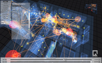
Project Replace, by Carson Smuts and Jason Nawyn
In this case of designing a new interaction of near future home, without any sensors planted in my apartment, I did a manual hotspot test of frustration while using current home interface in my apartment, which is quite amusing when turned out:
Drawn by Honghao Deng
Prototypes regarding this is coming soon… Here is one of the previewing sketch
Sketch by Honghao Deng
to be continued...